Life expectancy in Japan - A global perspective
Introduction
Japan currently has one of the highest life expectancies in the world, with an average life expectancy of 84 years. The country has experienced a consistent increase in life expectancy over the last 60 years, propelling it to the top of the rankings. In this article, we explore the global development of life expectancy, focusing on Japan. Get ready for an interactive journey that takes you from a worldwide perspective deep into the fascinating story of Japan. How has life expectancy developed globally? What factors contribute to a longer life? How has Japan unlocked its potential for longevity? And is there a limit to the human lifespan? If these questions pique your interest, this article is for you.
The Last 60 Years Globally
This chapter examines the global development of life expectancy over the last 60 years. During this period, the worldwide life expectancy has increased from 50 to 72 years. This remarkable development is particularly due to many countries in Asia, Africa, and South America catching up with the Western world.
Data source: Kaggle (WHO)
We see how drastically Africa has improved over the period. Meanwhile, the countries leading the pack in 1960, like the Scandinavian countries, Australia, Japan, and Canada, are still at the top in 2020. However, the gap between the top and the bottom has been reduced significantly. This is a positive development for global health equity. Worth noticing is also the remarkable improvement in China, which has gone from a life expectancy of 33 years in 1960 to 78 years in 2020. We made the following bar chart to better illustrate the sheer magnitude of this development.
Sources: Kaggle (WHO data)
Developing countries like China and Afghanistan have seen the most considerable improvement in life expectancy. Developed countries like Japan and the Scandinavian countries have also seen an improvement, but less drastic. As one could expect, pushing the boundaries of human longevity becomes harder and harder. The different mortality rates also give rise to quite different population structures. The population is much younger in developing countries, while in developed countries, the population is much older. This is illustrated in the following plot.
Sources: PopulationPyramid.net (UN data)
Countries like Japan and China have had quite a shift in terms of their population pyramid. Going from the structure that characterizes developing countries, with a falling slope for each year, to a more balanced, or even upwards-going distribution. Meanwhile, India is somewhere in-between these two models, and countries like Afghanistan are still in the developing stage. However, a population with most people around retirement age is scary as well, as the working population has to support the retired population. This is a problem that Japan is facing right now and is one of the reasons why Japan is struggling with its economy.
Infant Mortality: The Key to Improving Life Expectancy in Undeveloped Countries
As seen in the previous section, it would be considered lucky to live to the age of 30 during 1960 in some of the undeveloped countries in Africa and even China (Which was during The Great Leap Forward). The life expectancy in these countries is comparable to the life expectancy in Europe in the 1800s. Similarly to that time in Europe, the low life expectancy is due to high infant mortality and an increased risk of dying from infectious diseases. Clearly, if you are unfortunate enough to die as a child, you will drag down the average life expectancy by a large margin. In a country where people die at age 80 on average, it would take 4 people to live to the age of 100 just to outweigh the death of one child. The following plot demonstrates how reducing the infant mortality rate is the first and biggest decider for increasing life expectancy overall.
Sources: Human Mortality Database (HMD)
The relatively less developed countries, like India, Brazil and South Africa, display the same trend of a sharp drop in survival rate for the first 5 years of a child’s life in 1960. In India, for example, you would have a 20 percent chance of dying before age 5. This trend is similar to what is seen in Denmark around 1900 (Which also is toggleable in the plot). After the first 5 years, the survival rate is more flat until around age 50, where it starts to drop again. The infant mortality rate is primarily a problem for the poorest countries and is often not the deciding factor of life expectancy between two developed countries.
Thus, one could expect that the next major factor is improving the lives of those over 50 by investing in and advancing the medical field and building a society where everyone can access these tools. A natural question to ask is then: Does the life expectancy of a country correlate with the wealth and health expenditure of the country? In the next section, we explore this question.
With Wealth Comes Health?
Moving forward to 2021, where the infant mortality death rate is relatively insignificant for developed countries, we aim to find factors that separate the countries with the highest life expectancy from the rest. We examine the correlation between life expectancy, health expenditure and GDP per capita.
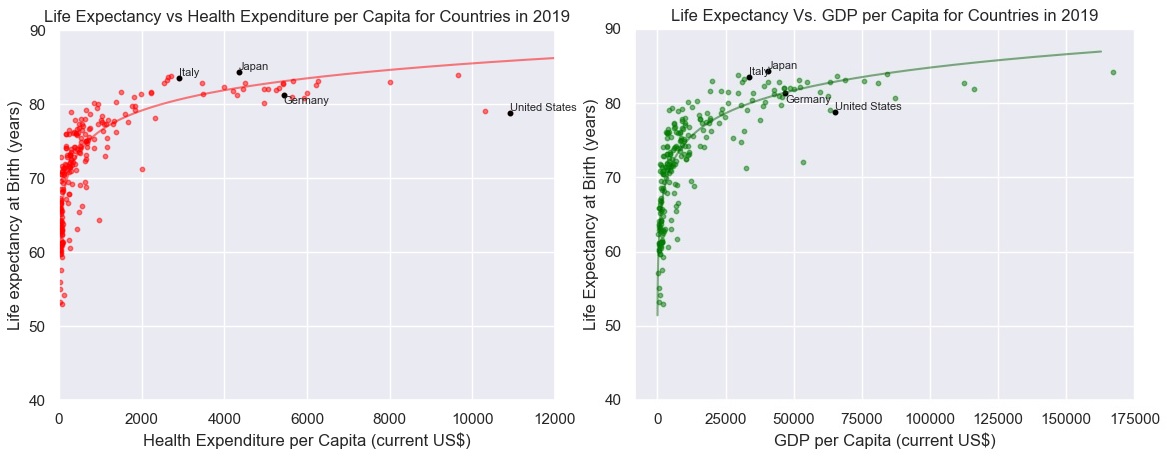 Sources: The World Bank
In both cases, there is a strong trend. However, we also see that the data resembles that of a logistic function, which we have drawn on the plot. And even a logistic function only partially encapsulates the countries with the most extensive wealth. This indicates that a country can only get so far (given the current technology) by having money and spending money on health care. Here we also highlighted Japan and other countries comparable to Japan in population size and development. Some interesting observations are that the USA is number one in spending money on healthcare while remaining relatively low in terms of life expectancy. Meanwhile, some of the top countries in terms of life expectancy, like Japan and Italy, are at a lower level regarding GDP per capita or healthcare expenditure. Instead, they score average in these two categories compared to similarly developed countries. This indicates that there are other factors at play here.
Exploring the Individual Factors: Investigating the Top Causes of Death in Japan, Germany, and Italy
As of now, we have only investigated life expectancy from a societal or national standpoint. It is time to dive into individuals and look at lifestyle, diet and culture. We will explore the specific cause of death in different countries to determine these factors’ effects. If we know the cause of death, we can relate this to the lifestyle of the people in that country. Here we show the top 10 causes of death in Japan, Germany, Italy and the United States.
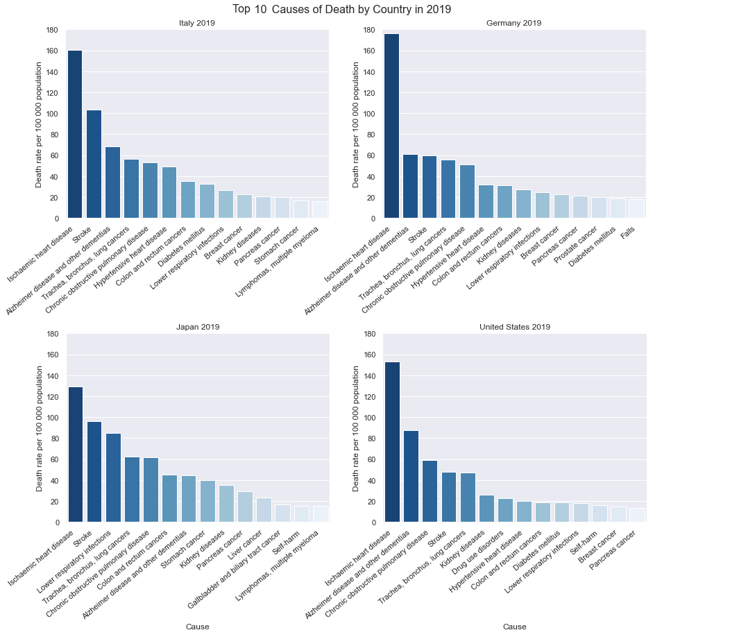 Sources: WHO
These top 10 causes of death make up around 50 percent of all deaths in the country. Globally speaking, it is more or less the exact causes seen here that constitute most deaths. Thus, seeing such a discrepancy in Isochaemic heart disease is quite significant. Some of the categories vary somewhat. Japan and USA, for example, has suicide (self-harm) as one of their top 10 causes of death. Indeed, even though Japan has the highest life expectancy, it is still beaten in quite some categories, mainly because strokes are frequent.
Japan: A Case Study in Life Expectancy
The Japanese have a culture of eating less red meat and more seafood and plant foods such as soybeans and tea. This is also known as the Washoku diet and is known to have multiple health benefits. For example, on average, the Japanese eat less than half as much meat as Canadians. Instead, they replace the meat with seafood which is associated with a lower risk of ischemic heart disease but an increased risk of stroke. In addition, The risk of stroke doubles every 10 years after 50. Thus, it makes sense that the Japanese population, having a particularly large part of their population older than 50, is extra prone to strokes.
Sources: OurWorldinData (UN FAO data)
Other risk factors of Ischaemic heart disease are smoking, high blood pressure, high blood cholesterol, diabetes, overweight and obesity, poor diet, physical inactivity, and excessive alcohol use. Japanese has a low rate of obesity, with only around 4.8% for men and 3.7% for women. Canada, for comparison, has 24.6% for men and 26.2% for women, while those numbers are just over 35% in the USA. Paradoxically, the Japanese people are not exactly known to be exercising a lot, and the low obesity rate is thus likely to come mostly from healthy eating habits. In addition, they have a high rate of high blood pressure, which is likely due to the high salt intake from Japanese diet. Furthermore, the Japanese are known to be workaholics and prone to stress, which is also a risk factor for Ischaemic heart disease.
Comparison between the countries for these factors are illustrated in these charts.
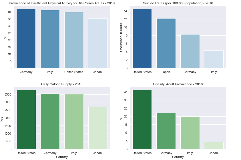 Sources: WHO
Sources: OurWorldinData (OECD Time Use Database data)
The Japanese exhibit by far the smallest obesity rate, despite dedicating only 30% of the time that Germans spend on exercise. This further reinforces the influence of their dietary choices. Additionally, the Japanese invest significant time in their work, which could indirectly contribute to their lower obesity rates. However, this commitment to work often compromises their sleep, as the Japanese sleep significantly less than their Western counterparts. It is well-documented that insufficient sleep is a risk factor for various mental and physical health conditions.
Research also emphasizes that having a fulfilling social life with a robust support network of family and friends plus living life with ‘purpose’ can increase longevity. However, in recent years Japan has seen the prevalence of loneliness, where young people increasingly are disinterested in dating. Furthermore, this development has only increased after the COVID-19 pandemic.
In summary, while Japan enjoys a remarkable life expectancy, it is essential to recognize that the population’s health profile is not without its imperfections. Each disparity comes with its own set of advantages and disadvantages. Therefore, while Japan serves as a model for longevity, it is clear that achieving a perfectly balanced lifestyle across all risk factors remains a complex challenge.
Thus, a natural question to ask is: is it possible to live a perfectly balanced life concerning these risk factors? And if so, how long can you expect to live?
Are We Approaching Immortality?
One way to approach this question is to look at the roof of life expectancy. It’s logical to assume there is some variance between how individuals live their lives, thus looking at the maximum age we should find some people who live a perfectly or nearly perfectly balanced life.
In the following plot, we showcase the documented oldest living human beings throughout history, comparing their ages to the life expectancy in Japan, as well as the life expectancy of the top 10 percent of the Japanese population in terms of longevity.
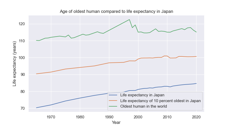 Sources: Wikipedia (Gerontology Research Group) & Human Mortality Database (HMD)
While the overall life expectancy in Japan continues to rise, a different trend emerges when observing the life expectancy of the top 10 percent of the population. Around the year 2000, this select group reached a life expectancy of 100 years, which has remained relatively stagnant ever since. Indeed, a similar pattern is observed when analyzing the age of the oldest living human. It appears that with today’s technological advancements, a near-perfect society could potentially ensure that nearly everyone lives to the age of 100. However beyond that threshhold it is in the hands of genetics and fate. This aligns with the insights provided by the “chance of surviving to this age” fraction plot, where we can anticipate a relatively flat line initially, followed by a sharp decline.
We are not immortal, and we are not approaching immortality. Our biological makeup is designed to facilitate reproduction, raise our children, and ultimately pass on the gift of life to future generations. However, we are approaching a society where almost everyone can live to be 100 years old, and that is a great achievement.
Reflecting on the Journey and Looking Ahead
Throughout this article, we have delved into the remarkable progress in global life expectancy over the past six decades, witnessing an overall increase of 22 years since 1960. This transformation has been driven, in large part, by developing countries in Africa and Asia narrowing the gap by significantly reducing child mortality rates. Simultaneously, developed nations have also experienced notable advancements in life expectancy. Among them, Japan stands out with its consistent and substantial rise in life expectancy since 1960, now claiming the top position as the country with the highest life expectancy worldwide.
We saw that GDP and health expenditure serve as reliable predictors for life expectancy, albeit only up to a certain point. Beyond that point, factors like diet, culture, and lifestyle gain prominence in shaping longevity outcomes.
Specifically focusing on Japan, we discovered that the nation experiences low instances of deaths related to Ischaemic heart disease. This can be attributed to their diet, which consists of less red meat and more seafood than what is usually seen in the west. Moreover, despite relatively lower levels of physical exercise, the Japanese population maintains a lower obesity rate due to their calorie intake and active work routines. However, it is important to acknowledge that these favorable factors also come with downsides. For instance, the higher seafood consumption is associated with an increased risk of strokes, and excessive work commitments can contribute to stress and inadequate sleep
So while Japan has the highest life expectancy in the world, it is far from perfect. Considering the current state of technology, consistent human longevity beyond 100 years appears unlikely. Nevertheless, the fraction that will get to experience such a long life keeps increasing. Perhaps, in the future, advancements in science and medicine will bring us closer to the concept of immortality. However, it is worth contemplating that while the pursuit of longevity captivates our imagination, cherishing the finite time we have on this Earth remains equally vital.
Code
All the code and data used to produce the plots in this article is can be found here. All the data files are in the repository; so if you wish to run the code, or get access to the data for other reasons, be sure to clone the repo first. For easier readability, you can also also see the explainer notebook hosted on NBViewer.
Data Description and Preprocessing
In this section we go through each dataset used one by one and provide description and basic stats.
-
The WHO data on life expectancy for countries over time
This dataset is clean from the beginning and consists of 4 columns. The first column is a short-hand code for the country’s name; the second column is the country’s name, the third column is the year, and the fourth column is the life expectancy.
The data has no missing values and is easy to use. We use this data to plot the development of life expectancy over time for different countries on a global map. In total there is around 15000 rows, 60 rows for each country (as there is 60 years), and there are 255 countries in total (including territories). The dataset is in the github repo called “life_expectancy_by_country.csv”.
-
These are the GDP and Health datasets. For both datasets, we did the same preprocessing. The data contains values for years and countries about GDP or health expenditure in dollars per capita. This data is less clean. There are a lot of NaN values which we have excluded. We preprocess this dataset by combining it with the WHO dataset to get a new dataset with 4 columns, year, country,life expectancy and GDP/Health expenditure.
The clean dataset is called “life_expectancy_by_country_with_GDP.csv” and “life-expectancy-vs-health-expenditure.csv” and the raw data is found in “API_SH.XPD.CHEX.PC.CD_DS2_en_csv_v2_5359940” (for the health data) and “API_NY.GDP.PCAP.CD_DS2_en_csv_v2_5358417.csv” for the GDP data.
-
This data is what is used to make the population pyramid plots. Each CSV file we got from here represents one country in one year. The data simply consists of 3 columns, age group, amount males and amount females. The only preprocessing that was necessary here was to combine the number of males and females into 1 column, as we decided not to focus on the difference between male and female in this scope. For each country we included there is 21 rows and the data is found in the “data” folder. (where the files are called countryname-year.csv eg. Canada-1960.csv.)
-
This data is used to plot the time spent on daily activities. The data is clean from the beginning and consists of 3 columns, country, activity, and percentage of people doing the activity. There is only 56 numbers, consisting of 14 activities 4 countries. As there is so little data for this plot, we hardcoded the data as lists in the code. The code can be viewed either on github or nbViewer.
-
For these 4 indicators, we used the most recently available data. For obesity and suicice rates this meant data from year 2016, whereas data from 2019 and 2018 was downloaded for prevalence of insufficient physical activity among adults and daily caloric supply, respectively. These data came clean without NaNs and, thus, did not require further preprocessing. The data files simply include two columns; a country column and the value of the indicator. The data is found in the “data” folder and is called “daily-per-capita-caloric-supply.csv”, “obesity.csv”, “physical_ac.csv” and “sui.csv”. Each csv file contrains only 4 rows, one for each of the 4 countries.
-
Cause-specific mortality rates for Germany, Italy, US and Japan data from WHO
This data comes clean without NaNs in Excel files for the individual countries. We only kept the 90th percentile of data for each country to visualize that information as the top 10% most common death causes. The dataset consists of many different columns that described this cause of death (eg. Dayli deaths, yearly deaths, deaths per 100 000). The data is found in the data folder and is the xlsx files. Eg. “italy.xlsx”
-
Meat consumption data from UN FAO - downloaded from OurWorldinData
This data originates from the Food and Agriculture Organization of the United Nations and was obtained via OurWorldinData. The data is clean and did not require further preprocessing before visualization. As there is so little data necessary for this plot we hardcoded it in the source code.
-
This website is comprehensive but also by far the messiest to make good use of. Here we obtain the life tabless data tables that can be used to calculate life expectancy and conditioned life expectancy (e.g., given you are this old, how long can you expect to live). This data is used in the “chance of surviving to this age” plot and the plot with the oldest human. For each country, they found sources covering intervals in years that you can check up on. So, for example, some sources may contain data from only every 5 years in some intervals, while other intervals every year, and some years no data at all. In addition, it is very rare for less developed countries to have any sources that go further back in time than the year 2000. The preprocessing consisted of finding a reliable source for each country and year intervals and hopefully finding enough to more or less cover the entire span of 1960 to 2020. (else we simply did linear interpolation between the years we know). The dataset also comes with many other features that had to be sorted out and were separated into male and female, which we simply combined into one category.
The data is found in the “life_tables” folder. Each csv file represents a country and can consist of any number of rows depending on the sources used. For example Denmark has 23000 rows while bolivia has only 600. This is because there are many more sources on the Danish data and the data is from more years. (and more complete)
References
https://www.clinicbarcelona.org/en/assistance/diseases/ischemic-heart-disease/risk-factors (more factors for the Ischaemic heart disease)
https://observatoireprevention.org/en/2021/03/09/why-do-the-japanese-have-the-highest-life-expectancy-in-the-world/ (Why Japanese diet is good, comparison to Canada and USA)
https://data.worldbank.org/indicator/SP.DYN.IMRT.IN?locations=ZG (Infant mortality rate worldwide)
https://ourworldindata.org/life-expectancy (Inspiration for plots and data)
https://www.worldlifeexpectancy.com/cause-of-death/coronary-heart-disease/by-country/ (Cause of death by country)
https://www.cdc.gov/stroke/risk_factors.htm (Risk of stroke times 2 every 10 years after 50)
All data sources
https://www.who.int/data/gho/data/themes/mortality-and-global-health-estimates/ghe-leading-causes-of-death?fbclid=IwAR081vAnkAIl9uqx9fAs4uHtVPJJMMZI4ah4Qv-_6I0aR5SupFtyHWkOf9A (Data on cause of death, data is from WHO)
https://www.lifetable.de/ (All life-table data has been downloaded from here, internal sources can be found in link)
https://www.kaggle.com/datasets/ulrikthygepedersen/life-expectancy?fbclid=IwAR0JO7W1_G3prS0O48OITDxvSeQPm64MtaUOIbfNjBCzcHttAUh_tC3xJME (Life expectancy data for years 1960 to 2019 for many countries, data is from WHO)
https://data.worldbank.org/indicator/NY.GDP.PCAP.CD?fbclid=IwAR2Jf_Asqt1WWMuQ_S1bobud8Q36WcVEYDx4lF0RrdCprmiESBD0yyNaGDk (For GDP per capita and health expenditure per capita, data is from World Bank)
https://www.populationpyramid.net (Population pyramid for all countries)